Wednesday, 17 December 2014

Rembrandt: Stations of the Cross - "The Three Crosses"


In 1653, Rembrandt (1606-1669) created the etching “The Three Crosses”.  There are four “states” of this image which depicts Christ on the cross between two thieves, surrounded by a crowd of people.
“States” are created by taking a print then revisiting the plate, changing something and reprinting the image – so the overall image is the same but with minor changes to texture, figures, shadows, etc.


I think this is an interesting image as, whilst the overall image is the same, in my opinion the small changes make it seem like a “spot-the-difference” puzzle. I think this engages the viewer and makes them concentrate more on what is actually in the image.
The changes in the amount/colour of ink and the various textures created when removing some of the ink, adds interest as these factors change the illusion of light and shadow as well as making the different parts of the image more, or less visible.


I like the third state most as, while it still gives the impression of the light and darkness, it is not as bright/harsh as some of the others.

I don’t think this image has a hidden meaning, I think it is just an illustration of what Rembrandt imagined Jesus’ crucifixion could have been like. I also think these images have an almost “illustrated Bible” feel to them as the general impression is that Rembrandt was trying to show what he believed that moment of history was like – much like anyone from a time long after that which they were drawing, Rembrandt wouldn’t have had a clue as to what it would have been like for the people there because he wasn’t there.

Thursday, 13 November 2014

Eduardo Paolozzi


Eduardo Paolozzi (1924-2005) created the Screenprint “Ciao Picasso” in 1975.

I like the cog look and style of the image as it conjures an image of gentle ticking of clockwork. I think the wide variety of shapes and colours create interest within the image. I particularly like the softer pastel colours. I also think the rounded edges and shapes create a nice, smooth, flowing appearance to an otherwise “mechanical” design.  I think this is also achieved through the use of the tubular shapes and lines within the image.  There is also some vertical symmetry in the bottom right of the image both in shapes and colour.
Overall this image creates a very reflective atmosphere with the passage of time in the clockwork design. I think this makes it quite thought provoking as it makes the viewer think about all the different clock pieces. I like that, even in chaos, peace/tranquillity can be found.

Wednesday, 5 November 2014

Generation Exhibit Scottish National Gallery October 2014


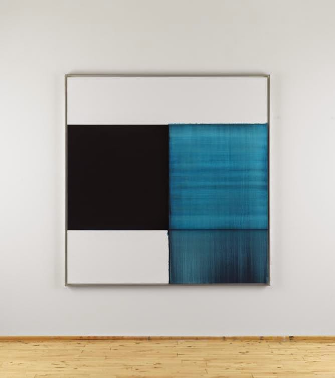
Exposed Painting, Pthaloraine Blue Lake 2014. Oil on Linen. By Callum Innes (b 1962)
I like this image, as the mix of soft and hard edges creates a variety of bold and slightly hazy colours and shapes. I really like the range of lines, colours/tones within the image as a whole but particularly in the top blue square. These lines and colours/tones create interest and an idea of a sea-scape type image to this abstract image of simple shapes.


Exposed Painting, Panes Grey/Yellow Oxide/Red Oxide on White 1999. Oil on Canvas. By Callum Innes (b 1962).

I like this painting because its simple shapes, almost natural colours and abstract style, in a way, make it ambiguous, leaving it open to interpretation.  I also like the more natural colours – the different shades of the pinky-peach colour - as it creates a sort of calm in the otherwise loud and busy atmosphere of the gallery exhibition. I think the softer edge, which goes slightly over the straight line, gives a suggestion of the idea that sometimes it is good to think outside the box… I really like the mix of hard and soft edges as it creates a nice contrast/juxtaposition within the image, reinforcing this idea.


Picasso Vollard Suite


In 1952, Picasso (1881-1973) created “Minotaure blesse VI” using Lithography.


I think this image has elements of the cubist style. The faces at the top create an eerie atmosphere like everyone is being watched, and this atmosphere is deepened by the unnatural flatness to the faces. There is also an outline of a hand in the top right which appears to be reaching out for the Minotaur. The Minotaur has very exaggerated musculature giving the idea of immense strength.
I like the very dark outline with various paler lines as they create a slight suggestion of movement. I think this also creates detail e.g. fur on Minotaur’s head, and lines where the muscles/body have shadows etc.


Thursday, 30 October 2014

Cecil Collins


In 1965, Cecil Collins (1908-1989) created “The Great Happiness” using Etching. 

I think this image is interesting because, in my opinion, the greyscale of the image leaves its subject matter open. I can’t decide whether I think it is a seascape with waves and spray from the ocean, or if it is a starry night maybe with some fireworks creating the spray-like effect in the sky, or if it is something else entirely. I like this mystery and ambiguity as I think it gives more power to the viewer whilst also making them use their imaginations as to what it could be depicting.
I think the contrast between the dark panel at the bottom of the image against the light panel in the middle and the sort of middle tone at the top, gives the overall image a slightly more realistic and believable appearance.

Wednesday, 29 October 2014

Cecil Collins


In 1951, Cecil Collins (1908-1989) created “Hymn to Night”.

I think the darker top and bottom of the image with the colour getting lighter towards the middle, creates a mysterious and haunting atmosphere with a suggestion of danger. I like the range of tones in the sky as it gives a real feeling of distance and perspective. I also like the way that the figure is almost part of the tree which to me suggests the idea that people could be one with nature if we ever tried or wanted to be.

I think the shape in the sky, on the right of the tree, at first looks like a cloud but looking closer I think it could be the shape of an angelic type figure flying towards the figure in the foreground.

Monday, 27 October 2014

Futurism


Futurism was an art movement with political implications that started in 1909 and it was the most important Italian avant-garde art movement of the 20th century.
The Futurists were fascinated by new visual technology, in particular chrono-photography, a predecessor of animation and cinema that allowed the movement of an object to be shown across a sequence of frames. This technology was an important influence on their approach to showing movement in painting, encouraging an abstract art with rhythmic, pulsating qualities.

Their enthusiasm for modernity and the machine ultimately led them to celebrate the arrival of the First World War. By its end the group was largely over as an important avant-garde, though it continued through the 1920s, during that time several of its members went on to embrace Facism, making futurism the only 20th century avant-garde to have embraced far right politics.


Giacomo Balla (1871-1958)
Flight of the Swallows 1913

 
Balla has created the swallows’ speed and movement by placing them in precise sequence, one after another. He appears to have included the rigidity of the window shutters to contrast their motionlessness with the birds’ continuous movement.
I like the powerful suggestion of speed, movement and energy in this image as it makes it very life-like.


Gino Severini (1883-1966)
Armored Train 1915

In this image, five faceless figures crouch in a militarised train car, aiming their rifles in unison. Smoke from gun and canon fire shroud the natural landscape. Severini celebrated war, which the Futurists believed could generate a new Italian identity- one of military and cultural power.
I think this image looks pretty at first, but then looking closer you can see soldiers which look like they are in trenches. I also think that their squared faces and bodies make them look as mechanical as the train and guns around them.
 

Carlo Carra (1881-1966)
Interventionist Demonstration 1914

This image was inspired by Carra’s sighting of leaflets dropped from an airplane as they fluttered down over the Piazza del Duomo. He has used the Cubist style in this collage poem with the composition moving outward from the center in concentric circles and with a number of rays or lines of force moving out from the center giving an impression of an explosion.
The layered items create illusion of perspective. This idea was also used in synthetic cubism – using items from the real world in a painting. The visible overlaps also suggest a busy atmosphere.
While the colours vaguely suggest an explosion, I only saw the leaflets within the image.

Wednesday, 22 October 2014

Jim Dine


Jim Dine (b 1935) is an American artist. Although closely linked with Pop art, what sets him apart from his peers is his depiction of intensely personal images such as shoes, neckties, and tools; the latter of which he came to appreciate while working in his grandfather's hardware store as a teenager.

 This image, created in 1984, is one of a series/suite of 28 prints using dry point etching which make up the book “The Temple of Flora”. The dry point technique has been used to give an overall soft look to the image.
I like this image because it shows how fragile nature can be whilst also showing the beauty that it creates. I also like the falling seeds/pollen as well as the veins on the leaves and petals which add texture to the image. I think the dark patches near the bottom of the image give a feeling of shadow, and to me suggest something lurking in the undergrowth therefore giving a feeling of wariness. I really like the way that the curving stems of the flowers draw your eye to different parts of the image in an almost continuous pattern.

Wednesday, 8 October 2014

Impressionism


Claude Monet (1840-1926) painted “Grainstacks: End of Summer” in 1891 using oil paints.

Monet used skills of painting with pure colour to capture an exact moment of the day. He discovered that the same objects in different light have a different mood. He often painted the same scene at different times of the day, each time using different colour themes. Monet dabbed the paint on in short strokes of strong colour. He has used oil paint and you can just make out the texture of the paint because he has layered the pigment on in thick textured marks. He accentuates the colours of the sky by using the idea of silhouette and places the stacks against the light.

 
  I like this image as it gives a calm, happy feeling by conjuring memories of summer evenings in the countryside. I think the soft pinks and blues in the shadows give the painting more depth, while the darker blues and greens in the shadows help create a more summer-like atmosphere within the painting. The pale blues, greens and yellows in the sky also have this effect. I also think that the lighting on the hills, trees and grainstacks gives a more life-like impression to the image. However, this lighting also gives the impression that the image is slightly out of focus, giving it a soporific atmosphere.

  
Gustave Caillebotte (1848-1894) painted “Paris Street, Rainy Day” in 1877 using oil paints.

Caillebotte was a French painter, member and patron of the group of artists known as Impressionists, though he painted in a much more realistic manner than many other artists in the group. He was noted for his early interest in photography as an art form.

Due to the inheritance from his parents, Caillebotte could afford to paint without the pressure to sell his work. It also allowed him to help fund Impressionist exhibitions and support his fellow artists and friends (including Claude Monet, Auguste Renoir, and Camille Pissarro among others) by purchasing their works and, at least in the case of Monet, paying the rent for their studios.


 I like the style of this image – the tall buildings; the light reflecting off the wet umbrellas which draws your eye to the umbrellas; there is a sense of calm even though the number of people on the street suggests they are busy with getting on with everyday life despite the rain. The expressions on the faces of the front two people portray a feeling of being fed up of yet another day of rain.
I think the shadows and dark coloured reflections on the ground emphasise the rainy day element of the painting. There also seem to be small puddles forming between the cobbles, showing that it has been raining for some time, resulting in the cobles being more prominent within the painting.

I think the exaggerated perspective is meant to emphasise the sheer size of Paris streets. I also think that the people on the street look busier because they are more spaced out than one would expect which makes it easy to imagine that in just a moment, everyone in the painting will have moved and nothing will be the same.


Allen Jones


In 1999, Allen Jones (b 1937) created “Dance” using Lithography.
Lithography is a chemical process where the image is drawn onto a stone plate with a special grease-based crayon. An oil-based paint is stuck onto the stone with a sticky substance and then passed through a printing press with a piece of paper. The image is then transferred to the paper and colour can be added.
 

 The square edges of the orange against the yellow gives a suggestion of a door through which can be seen a couple dancing. This suggestion of a door and the idea of a curtain created by the blue material, gives a feeling of perspective and depth to the image. The yellow also gives the impression that the dancers are in the spotlight.

I like the colour in this image and the way that the black adds texture and shadow to the material. However, the image itself is not the sort of thing that I would stop and admire. It gives me a feeling of danger and makes me feel like I’ve got my guard up – I am not sure if it is the figure which seems to be sneaking off somewhere or the reddish orange or even the combination of the two, that gives me this feeling.

Wednesday, 1 October 2014

Tom Davidson


Tom Davidson (b 1956) used lino cutting to create “Highland Loch”.

I like this image as its simple shapes and blue-grey colour creates a complete sense of calm and tranquillity. The range of tones in the image creates a real sense of depth and distance.
The fine lines used for the trees, in the sky and on the hills creates an eerie/haunting atmosphere within the image. The lines used to create the ripples in the loch make the image more life-like/realistic as a whole. The small, dark islands give a feeling of loneliness and isolation creating a mysterious atmosphere.


Monday, 29 September 2014

Cubism

Cubism can be split into two phases: Analytic and Synthetic. The Analytic phase was between 1907 and 1912. The Synthetic phase was from 1913 through the 1920’s.  The Term “synthetic” refers to a process of building up a composition through the arrangement of freely invented forms; whereas, “analytic” refers to the breaking down of forms into their component parts.

In the Analytic phase, the cubist palette was very limited using black, browns, greys, and off-whites. Additionally, shapes were very geometric and fragmented, being put together from different viewpoints at the same time therefore creating an angular and distorted image. Analytic cubism was thought to be a criticism of traditional art, which limited the subject to a single place and time.

Marcel Duchamp (1887-1968)
One of his most famous works, “Nude Descending a Staircase, No.2” was created in 1912 using oil on canvas. This work was said to be scandalous “since nudes do not look like that”. This was the start of Duchamp’s analytical cubist work; however in 1913 Duchamp withdrew from painting circles due to being disillusioned by the Art Establishment.

At a first glance, I thought this painting was of a brush as the portrayal of movement in the lower legs looks like bristles and the solid effect of the repeated upper legs gives a suggestion of the body and handle of the brush.

 Juan Gris (1887-1927)
Gris was often referred to as the third cubist with Picasso and Braque being the first and second, however of the three he was the most dedicated to the style. His work “Bottles and Knife” was created in 1912 using oil on canvas and is a good example of analytical cubism using limited colours.

I like this image as the black creates a distinct shadow and therefore a realistic 3D effect. The angular lines throughout the image add an element of uncertainty while also creating an idea of depth providing the 3D effect.


In the Synthetic phase of cubism, paintings were composed of fewer and simpler forms. Brighter colours were used to a generally more decorative effect and many artists continued to use collage in their compositions.

Picasso (1881-1973)
This work is the last and most elaborate in the series of paintings he did based on his vast mural “Guernica” which portrays the bombing of the Basque town of Guernica. He created “The Weeping Woman” in 1937 using oil on canvas. The woman’s features are based on Picasso’s lover Dora Maar. The colour used in this work is a good example of synthetic cubism.

This image portrays a woman who is literally broken up with grief. This gives the appearance of the subject being disjointed and broken up and to the unsuspecting eye, the “Weeping Woman” (amongst other cubist works), would be quite harsh and shocking. He chose this subject matter to show that emotion and human nature is fragile. The image is constructed like panes of glass where the slightest knock could shatter the person.
 

Georges Braque (1882-1963)
 “The Viaduct at L’Estaque” was created in 1908 using oil on canvas and shows the gradual development of Braque’s independent artistic style before his meeting and joining forces with Picasso, demonstrating his crucial role in the birth of cubism. In this work Braque combines Cézannesque geometrically defined shapes and multiple angles of perspective with examples of his earlier, decorative Fauve style.

I like the brushstrokes in the trees and sky as it adds texture and creates an almost stormy atmosphere.  I think that the arches and shadows in the viaduct create a feeling of depth within the image. I also like the way that the different shades and tones of orange create a sense of warmth within the image.

Wednesday, 24 September 2014

The Art Establishment...


I think that the “Art Establishment” should allow artists such as Jack Vettriano to be part of their society because, even if some artists use templates or books to help them draw accurate figures, they still need to have the knowledge and skill to apply the paint or other media in order to create an image that the public will admire. The fact that Vettriano makes around £500,000 a year from reproductions of “The Singing Butler”, should tell the “Art Establishment” that they should rethink their attitude towards him and recognise him as a painter and an artist, (as they have previously refused to acknowledge this fact). 

"The Singing Butler" by Jack Vettriano

 I think his paintings are popular because they can give people hope for finding romance - even in a world like ours.
I also believe that popularity does not always mean quality. Popularity/appeal depends on taste – whether or not the viewer is drawn to the style or subject in the image. Quality is more complex to define but would include the technical skill that the artist has used to create the work. Many artists outside the "Art Establishment" would rather sell their work to many people instead of the elite few.

Tuesday, 23 September 2014

Georges Braque


Georges Braque (1882-1963) created the print “L’Oiseau Bleu et Gris” (The Blue and Grey Bird) in 1962, using lithography on woven paper.


I like the overall simplicity of this image as I think it suggests how simple life can sometimes appear to be from the outside. The blue reminds me of clear blue skies in the summer with birds flying and singing in the warm air. However the white in the bird’s wings has connotations of snow and, mixed with the blue, gives a cold feeling to the image.

The background appears to be in vertical stripes of colour with the bird being made of contrasting colours so that it stands out from the background. The blue and the wavy lines that appear across the bird, create the impression of waves therefore giving a suggestion of it being a sea bird. The pale colour in the wings gives the impression of the wave breaking.

Thursday, 18 September 2014

Samuel Palmer


In 1879, Samuel Palmer (1805-1881) used "Etching" to create this print of “The Bellman”.


I like the overall dark look of the image, particularly the smoke coming from the chimneys and the moon on the horizon lighting up the sky. I also like the detail in the trees, roofs and the highland cows lying in the foreground. I think the shadow created by the Bellman, on his way through the town to the church, suggests both presence and purpose. I like the way that the clouds are highlighted by the moon rising over the horizon, and how there are also some very dark clouds suggesting the darkness to come. I also think that the fact that the landscape is in greyscale emphasises the shades of night and the light from the rising of the full moon makes it brighter.


Peter Wray


Peter Wray (b 1950) created “Half Forgotten Voice” using “Carborundum”.


"In recent years, the term "Carborundum Print" seems to have evolved to cover all methods of collagraph printmaking which involve what may be loosely termed as "liquid" materials, i.e., materials which are painted on to the plate or applied in a liquid or semi-liquid form, often with a brush, palette knife or squeegee, as opposed to materials which are cut-out and glued down. Nowadays many so-called carborundum prints do not contain any carborundum at all in their construction, and are composed of other materials, for example, ceramic tile cement, PVA glue, epoxy resins, etc."

“His work over recent years has investigated the concept of the personal ‘journey’, in terms of geography, chronology, narrative and spirituality, and, above and beyond the journey itself, has focused on the notion of the ‘starting-point’ and the ‘journey’s end’ as elements of reflection within his own experience and resulting philosophy. The work, and the activity of making, becomes a vehicle for reflection in its own right, and by its very nature, becomes part of the journey itself.”


I think this image gives a feeling of division, separation and fear but also strength and warmth. I found that if you look into the red, buildings or some sort of structure or skyline, can be seen. I like the way that the combination of the street-view, in the red, and the birds-eye-view, in the centre of the image, makes an interesting composition with many possible meanings.