Thursday, 13 November 2014

Eduardo Paolozzi


Eduardo Paolozzi (1924-2005) created the Screenprint “Ciao Picasso” in 1975.

I like the cog look and style of the image as it conjures an image of gentle ticking of clockwork. I think the wide variety of shapes and colours create interest within the image. I particularly like the softer pastel colours. I also think the rounded edges and shapes create a nice, smooth, flowing appearance to an otherwise “mechanical” design.  I think this is also achieved through the use of the tubular shapes and lines within the image.  There is also some vertical symmetry in the bottom right of the image both in shapes and colour.
Overall this image creates a very reflective atmosphere with the passage of time in the clockwork design. I think this makes it quite thought provoking as it makes the viewer think about all the different clock pieces. I like that, even in chaos, peace/tranquillity can be found.

Wednesday, 5 November 2014

Generation Exhibit Scottish National Gallery October 2014


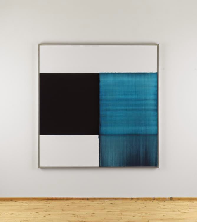
Exposed Painting, Pthaloraine Blue Lake 2014. Oil on Linen. By Callum Innes (b 1962)
I like this image, as the mix of soft and hard edges creates a variety of bold and slightly hazy colours and shapes. I really like the range of lines, colours/tones within the image as a whole but particularly in the top blue square. These lines and colours/tones create interest and an idea of a sea-scape type image to this abstract image of simple shapes.


Exposed Painting, Panes Grey/Yellow Oxide/Red Oxide on White 1999. Oil on Canvas. By Callum Innes (b 1962).

I like this painting because its simple shapes, almost natural colours and abstract style, in a way, make it ambiguous, leaving it open to interpretation.  I also like the more natural colours – the different shades of the pinky-peach colour - as it creates a sort of calm in the otherwise loud and busy atmosphere of the gallery exhibition. I think the softer edge, which goes slightly over the straight line, gives a suggestion of the idea that sometimes it is good to think outside the box… I really like the mix of hard and soft edges as it creates a nice contrast/juxtaposition within the image, reinforcing this idea.


Picasso Vollard Suite


In 1952, Picasso (1881-1973) created “Minotaure blesse VI” using Lithography.


I think this image has elements of the cubist style. The faces at the top create an eerie atmosphere like everyone is being watched, and this atmosphere is deepened by the unnatural flatness to the faces. There is also an outline of a hand in the top right which appears to be reaching out for the Minotaur. The Minotaur has very exaggerated musculature giving the idea of immense strength.
I like the very dark outline with various paler lines as they create a slight suggestion of movement. I think this also creates detail e.g. fur on Minotaur’s head, and lines where the muscles/body have shadows etc.