In October 2016, my Auntie Caroline and Uncle Jonathan came to stay with us for a few days and, as with any guest, we all got our hobbies/interests/work put on show. I showed some of my college artwork including the book I made for the Narrative Image Making unit on "The Mermaid". Auntie Caroline liked my style of illustrations so much that she asked me if I would be interested in illustrating some of her poems.
The poems all have religious themes, as my aunt is a minister down in Dorset. It was sometimes challenging to find the right balance between implying and showing the religious imagery. The poems included 15 Stations of the Cross (basically the Easter story), and 18 poems on other topics.
The following is from "Reflections of the Heart". Text copyright © Rev Caroline M. Chichester 2017. Illustration copyright © Catherine R. L. Bird 2017.
Here is a selection of the illustrations I did (and then overlayed the poem):
 |
| Spiral |
 |
| A Cry of Anguish |
To help convey the more serious time of the poem, I decided to use 'Viner Hand ITC' as the typeface for this poem.
The poem talks about butterfly wings and footprints in the sand. I used the sunbeams and the butterfly to continue the idea of the fragility of hope. The last line of the poem is "...God is there." which I wanted to show with a few large footprints disappearing under the waves alongside the footprints of the lonely figure on the beach.
One of my favourite parts of this illustration is the contrast between the bright colours of the butterfly and the grey scale background.
 |
| The Joy of God |
I chose 'Curlz MT' as the typeface for this poem as the baseline waves up and down, creating a sense of joy and movement as though the poem itself was dancing!
The poem mentions sunset and I decided to do reflections on the sea as a background for the poem. This is the last poem in the book and I think the reflections link back to the title of the book.
The 'Stations':
 |
| Station 5: Pilate |
This is one of my favourite illustrations from the book because I feel like I'm in the room, looking out the window towards the horizon.
 |
| Station 8: Simon of Cyrene |
 |
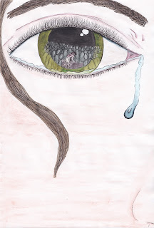
| Station 9: Jesus meets the women of Jerusalem |
The hair in this illustration uses a similar texture as the wood grain in some of the other illustrations and so continues the theme/idea.
Most of the 'Stations' have a continuing theme of wood somewhere in the illustrations which helps connect them to each other. Auntie Caroline and I decided to use 'Tempus sans' as the typeface for all of the 'Stations' to tie them together more.
If you're interested in buying the book, please contact me for further details.


