Tuesday, 31 March 2015

Robert Smail's Printing Works

The Robert Smail's Printing Works in Innerleithen was established as a jobbing printer in 1866. The property includes a fully operational letterpress Printing Works (Paper Store, Case Room and Machine Room), the original Office and a Gift Shop. It was taken over by the National Trust for Scotland in 1986 when Cowan Smail retired and opened to the public in 1990.

Cowan Smail was the third generation of the family which had owned the firm for 120 years. During that time, Smail's carried out print jobs for the whole community and they published a weekly newspaper, The St. Ronan's Standard and Effective Advertiser, from 1893-1916.

The Smails were serious hoarders and because of this, there are job dockets, invoices, wages books and ledgers dating back to the start of the business, stacked on shelves in the office. The archive includes 52 original guardbooks which contain a copy of every job printed at the Works for nearly a century.


The Case Room is filled with rack after rack of different typefaces. Here everything was carefully set by hand - and still is! - for Smail's made little attempt to enter the twentieth  century. 

During our visit to the Printing Works, we were given the opportunity to try handsetting for ourselves. This was quite hard as we had to read and spell upside down to ensure it would print correctly.

I found it particularly interesting that the "j" and "u" came after the "x y z" in the cases because they used to use "i's" for "j's" and "v's" for "u's".  We also learnt where "Uppercase" and "Lowercase" get their names from - It is because of the position that the respective type-cases are in - e.g. the capital letters are kept in the upper-case and the small letters in the lower-case.

The Uppercase and Lowercase

In the Machine Room we saw the presses in action including a treadle-operated Arab Platen, much larger Wharfedale Reliance (bought in the late 1800s) and the Hiedelberg Platen. When the presses were in action we saw the old belt and pulley system, which dates back to when Smail's ran on waterpower.

The Hiedelberg Platen
Smail's is still very much part of the town of Innerleithen. It is still producing printing work, using the original Victorian letterpress techniques and machinery.

I really enjoyed this trip and would definitely recommend it for a place to visit.


Wednesday, 28 January 2015

Recycled and Unusual Jewellery


As part of the course, my class has been doing a unit called "Exploring Specialist Techniques" which involves us researching something we are currently interested in or something that we would be interested in finding out about (- exploring). Then we focus on a selection of "practitioners" from our chosen area within art and design - I am looking at the work of Colette Hazelwood, The Hairy Growler Jewellery Company, Pierre Degen, and Dianne Fox. It was incredibly difficult finding names of people who make jewellery that is slightly different to the normal, retail varieties. I did find a site on people using bottles for unusual things but the closest thing it had to jewellery was a stand/holder for jewellery but it had no actual pieces using bottles/bottletops. 


 As we are "exploring" these practitioners and their work, we also try out/experiment with some of our ideas that may involve or be inspired by the work of practitioners we look at.

Before I started this course, my family and I went to Orkney for a few days and saw leaflets advertising the "Craft Trail". Included in this trail was the workshop of Sheila Fleet, a very well-known jewellery designer, which we decided to go to.  On arrival we were given a tour of the workshop where we saw various people at work at the different stages of the jewellery making process.  We watched some jewellers using goose quills to apply enamel on to the silver work and then people polishing the final item of jewellery.

I really enjoyed this tour and it is part of the reason I started making my own jewellery.  This experience increased my interest in jewellery making.  At present I don’t work with sterling silver or other metals or the enamel I saw being used but it is something that I would like to progress to.  Up to now I have been using beads, eye pins, headpins, various chains, jump rings, lobster clasps, toggles, extender chains, as well as a few charms.  I have also tried to design a selection of rings, using both bought ring bases and eye pins.

For this unit I started out doing 'recycled jewellery' using milk bottle tops, crisp packets and, later on, corks. Part way through the project I thought it would make it even more interesting to make it 'unusual jewellery' and include things like paperclips instead of normal chain. I also tried using safety pins with a few beads on them.

'Unusual Jewellery' means it could be made from anything that isn't normally used for jewellery e.g. paperclips, crisp packets, bottle tops, corks, etc. which are all unusual objects for jewellery making.

 I started with plastic milk bottle tops, making flat circles to use as charms for necklaces, earrings and bracelets.  I have also used them as flat components for a bracelet and a necklace.  Making the flat discs was quite tricky to get cleanly cut discs/circles – first I used metal hole punches of varying sizes with a wooden mallet but these did not always give a clean cut. I ended up using the punches to make an outline of the circle and then used scissors to complete the task which produced an acceptable finished item.  I then moved on to using a Stanley knife for the larger circles to remove the bottle top rim which seemed to work quite well.  Compiling the different sized circles into items of jewellery was relatively straight forward without too many difficulties.
 
I then started experimenting with crisp packets using the idea from a section in CBBC programme “Totally Rubbish”, which gives measurements for the template for the components as well as instructions on how to fold and assemble these into bracelets, belts and even placemats. The first bracelet I made using this method, took a lot of patience (and chocolate!) to get the hang of linking several components together and even more for the final link as it was very fiddly to get the pieces to fit (and stay) together.

 
Up to this point I was using normal chain for the necklaces and bracelets, (chain was not required for the crisp packet items at this stage).  However, I was given the suggestion/challenge to find another material to use instead and I decided to use paperclips connected by jump-rings to create an unusual style of chain to complete the items of jewellery.


I then experimented making items of jewellery using only paperclips – using a mixture of coloured, black and white, gold and silver paperclips. While this had an interesting appearance, I thought it looked better with two beads as an extra feature within each item – I preferred this result to the original paperclip items without the beads. I also experimented using a crisp packet component in the place of the beads which I think had a similarly interesting effect.
 
I then started to think about possible ways to incorporate wine corks into my designs. I used a jewellery drill to make a hole through the centre of the cork so that I could use a headpin to attach it to the paperclip chain. Some of the corks had patterns/logos already printed on them so I used felt tip pens to fill in the blank areas with colours such as purple, brown and green (most of the patterns where images of grapes). I also tried varnishing some corks to see if it made any significant difference to the appearance of the corks – this created some interesting effects.

My final experiment was using candlewax. This happened quite by chance while I was helping clear some candles at Christmas and one of the candles had a complete ring around its base. I jokingly put it on my wrist as a bracelet and realised that it looked very unusual and that I could actually use it, and some of the other really interesting shapes from the candles, for my jewellery project. This was fun to do but as it was made of candlewax, some of the pieces were very fragile and easily broken and as a result were unable to be used as finished items. However, I would like to experiment further using this material to see how else it could be used within jewellery making.


I also experimented with combining different sizes of bottle top discs which then gave me the idea to try a similar design using small crisp packet components. 


Tuesday, 13 January 2015

Romanticism and Realism

Romanticism

Caspar David Friedrich (1774-1840) painted “Wanderer above the Sea of Fog” in 1818 using oil paints. Friedrich was able to express the ideals of the romantic period in his realistic and sentimental landscapes and to reflect atmospheres very accurately. In his artworks he creates a fantastic never ending vastness which is clearly portrayed in this picture. 
The Rückenfigur—a person seen from behind, contemplating the view – was commonly used by Friedrich to emphasise the vastness of nature. The viewer is encouraged to place themselves in the position of the Rückenfigur, therefore experiencing the visual impact of nature.


I really like this image as it suggests the pure insignificance of people in such incredible landscapes. I also like the way the fog and clouds create an element of mystery regarding the location which is most likely due to Friedrich creating a portfolio of sketches of the landscapes which he then enhanced by using his imagination for backgrounds in his paintings.

 Realism
Jean-François Millet (1814-1875) used oil paint to create “The Sheepfold, Moonlight” between 1856 and 1860.
Millet used his peasant background to create scenes of peasant life, reinforcing his influence on the Realist period of art. As an artist, Millet tried to make the viewer “hear the songs, the silences, and murmurings of the air”.
He successfully achieves this in this painting by giving a feeling of mystery, silence and the occasional rustling of the sheep resulting in a sense of the stillness of the night.

I like this image because it gives a feeling of complete calm and tranquility. I particularly like the way the light from the moon is what draws your eye to the shepherd and the sheep in the foreground. I think the shading of the sky from the lighter tones near the moon to the darker tones furthest away ­­­from the moon gives an atmosphere of mystery and wonder.


Wednesday, 17 December 2014

Rembrandt: Stations of the Cross - "The Three Crosses"


In 1653, Rembrandt (1606-1669) created the etching “The Three Crosses”.  There are four “states” of this image which depicts Christ on the cross between two thieves, surrounded by a crowd of people.
“States” are created by taking a print then revisiting the plate, changing something and reprinting the image – so the overall image is the same but with minor changes to texture, figures, shadows, etc.


I think this is an interesting image as, whilst the overall image is the same, in my opinion the small changes make it seem like a “spot-the-difference” puzzle. I think this engages the viewer and makes them concentrate more on what is actually in the image.
The changes in the amount/colour of ink and the various textures created when removing some of the ink, adds interest as these factors change the illusion of light and shadow as well as making the different parts of the image more, or less visible.


I like the third state most as, while it still gives the impression of the light and darkness, it is not as bright/harsh as some of the others.

I don’t think this image has a hidden meaning, I think it is just an illustration of what Rembrandt imagined Jesus’ crucifixion could have been like. I also think these images have an almost “illustrated Bible” feel to them as the general impression is that Rembrandt was trying to show what he believed that moment of history was like – much like anyone from a time long after that which they were drawing, Rembrandt wouldn’t have had a clue as to what it would have been like for the people there because he wasn’t there.

Thursday, 13 November 2014

Eduardo Paolozzi


Eduardo Paolozzi (1924-2005) created the Screenprint “Ciao Picasso” in 1975.

I like the cog look and style of the image as it conjures an image of gentle ticking of clockwork. I think the wide variety of shapes and colours create interest within the image. I particularly like the softer pastel colours. I also think the rounded edges and shapes create a nice, smooth, flowing appearance to an otherwise “mechanical” design.  I think this is also achieved through the use of the tubular shapes and lines within the image.  There is also some vertical symmetry in the bottom right of the image both in shapes and colour.
Overall this image creates a very reflective atmosphere with the passage of time in the clockwork design. I think this makes it quite thought provoking as it makes the viewer think about all the different clock pieces. I like that, even in chaos, peace/tranquillity can be found.

Wednesday, 5 November 2014

Generation Exhibit Scottish National Gallery October 2014


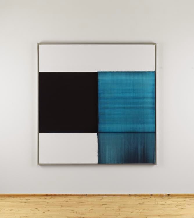
Exposed Painting, Pthaloraine Blue Lake 2014. Oil on Linen. By Callum Innes (b 1962)
I like this image, as the mix of soft and hard edges creates a variety of bold and slightly hazy colours and shapes. I really like the range of lines, colours/tones within the image as a whole but particularly in the top blue square. These lines and colours/tones create interest and an idea of a sea-scape type image to this abstract image of simple shapes.


Exposed Painting, Panes Grey/Yellow Oxide/Red Oxide on White 1999. Oil on Canvas. By Callum Innes (b 1962).

I like this painting because its simple shapes, almost natural colours and abstract style, in a way, make it ambiguous, leaving it open to interpretation.  I also like the more natural colours – the different shades of the pinky-peach colour - as it creates a sort of calm in the otherwise loud and busy atmosphere of the gallery exhibition. I think the softer edge, which goes slightly over the straight line, gives a suggestion of the idea that sometimes it is good to think outside the box… I really like the mix of hard and soft edges as it creates a nice contrast/juxtaposition within the image, reinforcing this idea.


Picasso Vollard Suite


In 1952, Picasso (1881-1973) created “Minotaure blesse VI” using Lithography.


I think this image has elements of the cubist style. The faces at the top create an eerie atmosphere like everyone is being watched, and this atmosphere is deepened by the unnatural flatness to the faces. There is also an outline of a hand in the top right which appears to be reaching out for the Minotaur. The Minotaur has very exaggerated musculature giving the idea of immense strength.
I like the very dark outline with various paler lines as they create a slight suggestion of movement. I think this also creates detail e.g. fur on Minotaur’s head, and lines where the muscles/body have shadows etc.